Branding & Digital Design for Cinematography Studio

Web Design
Visual Design
Branding
Nomenclature

Introduction

Laveer needed a visual language that communicated their style and approach to prospective clients before collaboration began. The nomenclature had to blend the owner’s respect for analog methods, their reverence for maritime enchantment, and their acute, emotional awareness. It didn't take very long for me to realize that Laveer’s care for craft was exceptional; instead of looking for shortcuts and cheats, they’re committed to practice and process.

From choosing the right film, camera body, and lens, to developing the resulting film in studio, they make sure each unique image tells a lasting story. My dad once noted that "great design appears timeless regardless of its time"; that very spirit was evident in this studio as well. It was my job, then, to help them "laveer," to sail headfirst into the wind.

The Challenge

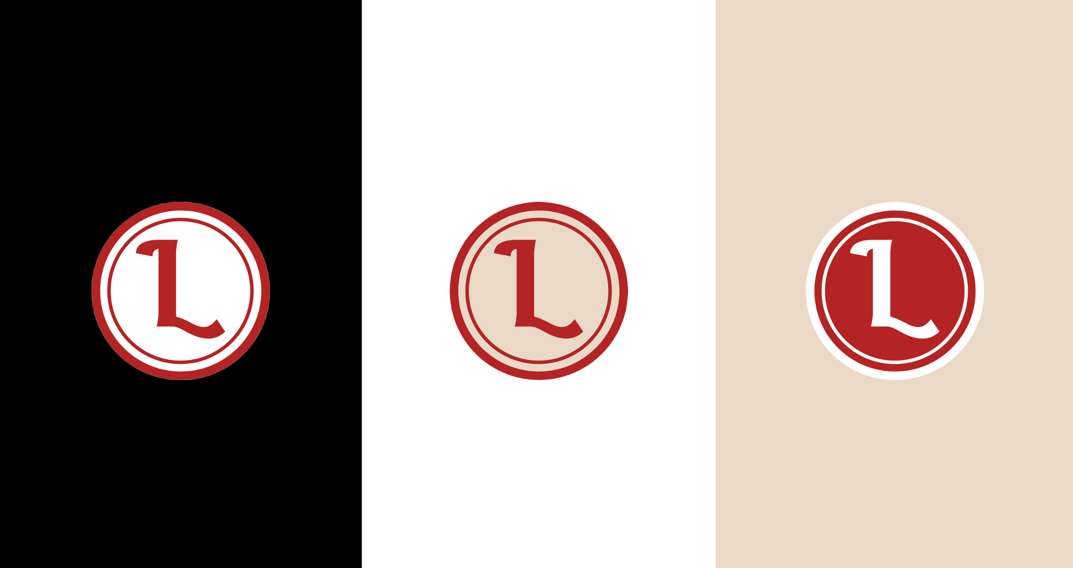
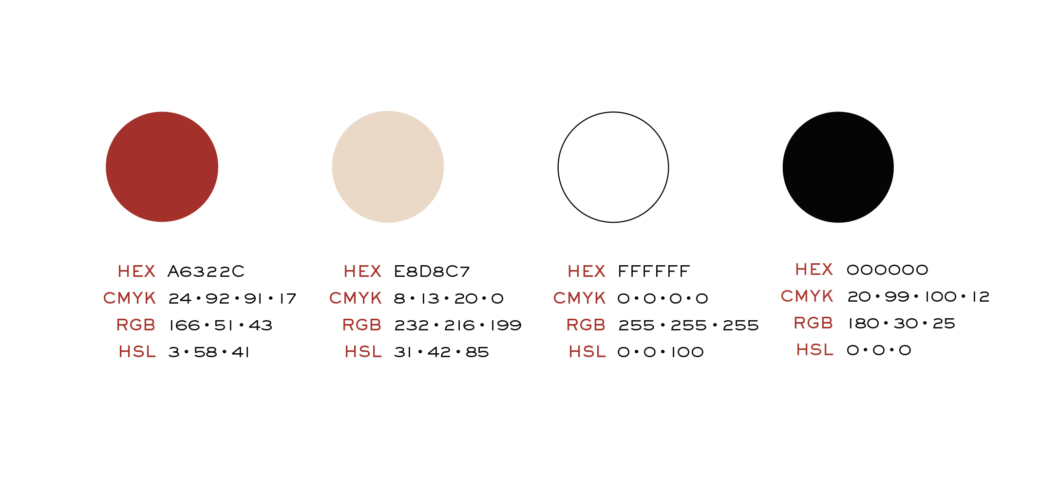
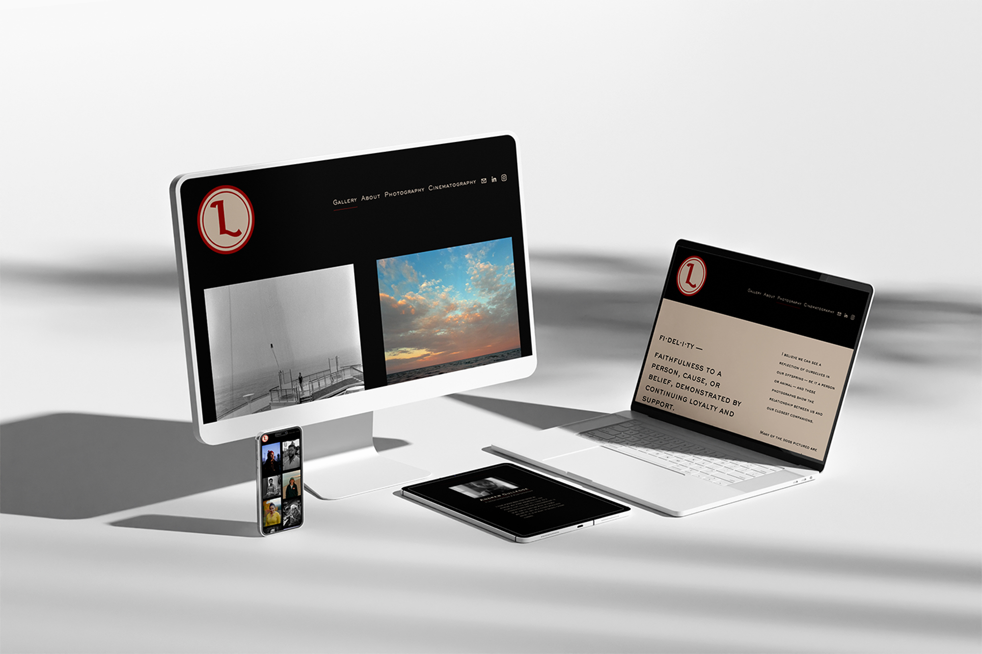
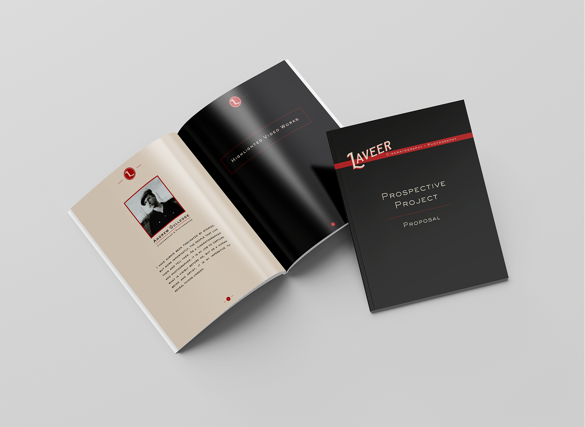
Combine two of the studio’s favorite design era inspirations into a single, harmonious identity and create a website they could easily update and manage.

Key Considerations

Nomenclature

Selecting a name that represents and illustrates the studio’s creative values.

Aesthetic

Infusing the brand identity with the studio’s medium and style.

Layout

Aligning digital and print materials to maintain a consistent visual rhythm.

Scalability

Designing assets the studio can update and manage independently.
Solution

Logo & Typography

One priority of Laveer’s work is preserving the tactility of historic tools, so it’s visual voice needed to reflect that. It needed to make a way for both Victorian romance and Mid-century minimalism. It's both sturdy and delicate; both elevated and accessible; both wax seal and gas station signage.
Three round logos with letter 'L' in a serif font, each shown on black, white, and beige backgrounds with inverted color schemes.Wooden handled wax seal stamp with a brass seal imprinting the letter L on a red wax seal on a white envelope.Typography sample showing Sackers Gothic Std Medium font in uppercase, lowercase and numbers on a black background and Garamond font in uppercase, lowercase, and numbers on a white background.

Color

When choosing the palette for Laveer, it was imperative to consider the emotional impact of vibrant hues. Because it can be boisterous and confident, I needed to choose a red with an approachable warmth. Combining this red with a subtle cream resulted in a bold yet inviting amalgamation.
Four color swatches with their HEX, CMYK, RGB, and HSL codes, showing a dark red, beige, white, and black color.

Web & Print Design

I kept Laveer’s site as simple as possible, allowing their work to do the talking and creating a layout they could update with ease.

Project proposal brochures serve as a visually cohesive way to describe to prospective clients what it would feel like to have Laveer’s lens tell their stories.
A desktop computer, smartphone, tablet, and laptop displaying a black-themed photography website with a red circular logo and image galleries.Opened and closed Laveer brochure with title 'Prospective Project Proposal'.The word 'CINEMATOGRAPHY' in large vintage-style cream letters with red shadows on a black background.Word 'PHOTOGRAPHY' in cream letters with red shadows on a black background.

Results & Reflections

Produced a brand identity with digital and print materials that blend historical inspiration with contemporary usability

Maintainability

Designing assets and layouts that the studio could update independently reinforced the importance of sustainable design systems.

Color Theory

Taking the time to manually fine tune properties like temperature, saturation, vibrance, etc. sets the stage for emotive interactions.

Nomenclature

Intentional language selection contributes to brand’s identity and client perception before words are even exchanged.

Aesthetic Tension

Using two different eras for inspiration allowed me to further understand how complementary differences can birth stronger solutions.
← AttisUnion Assembly
white arrow up