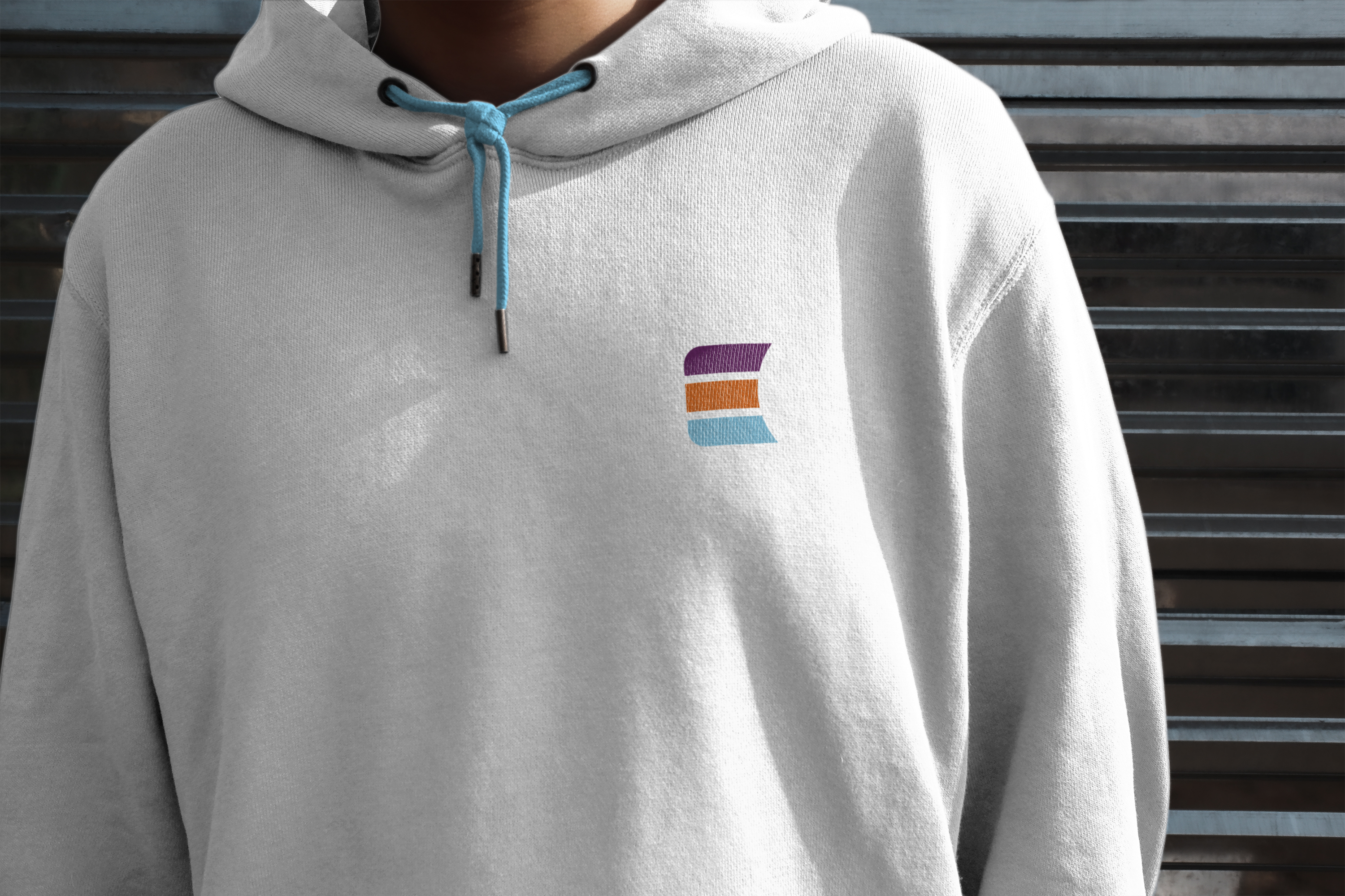
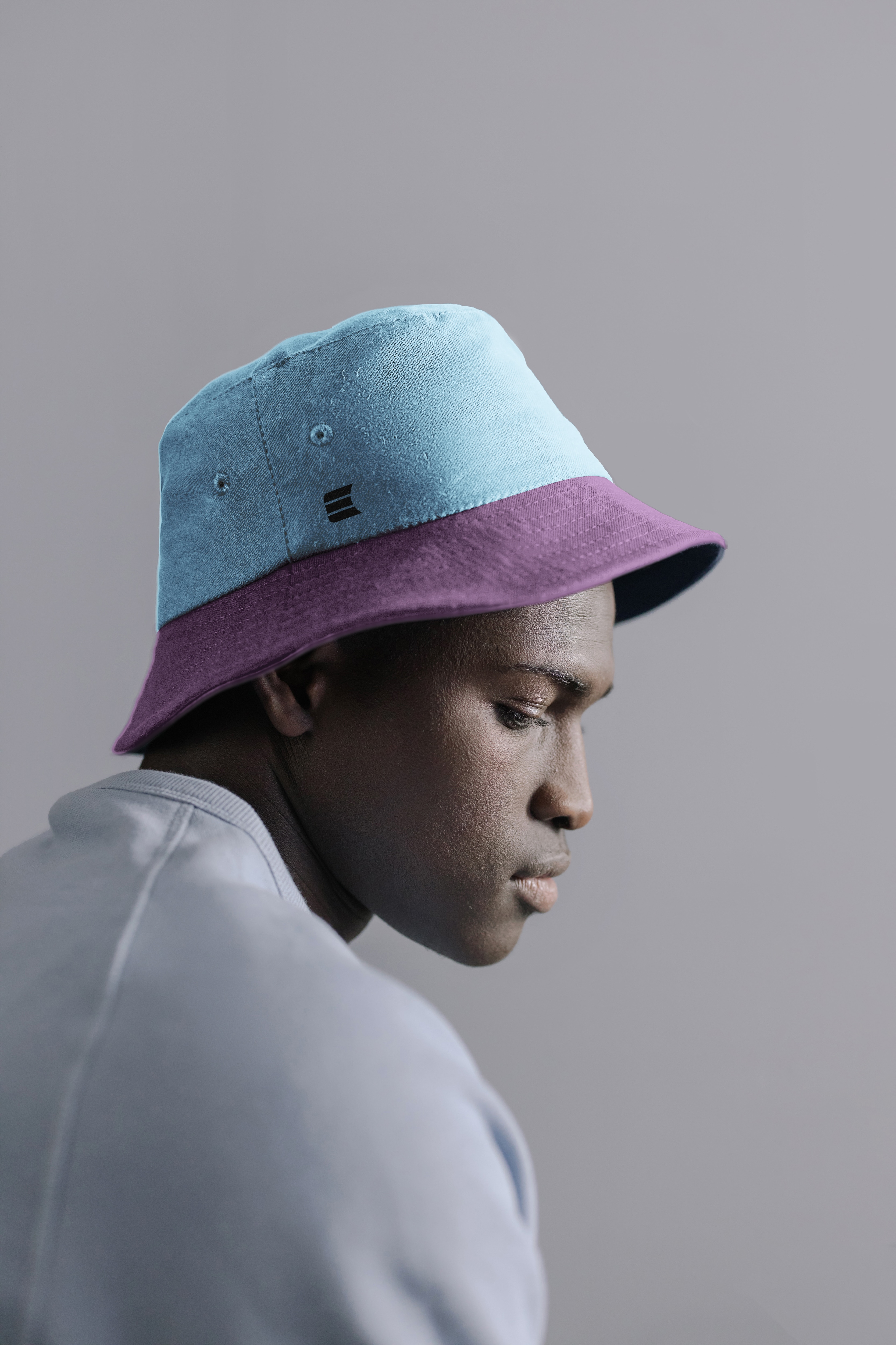
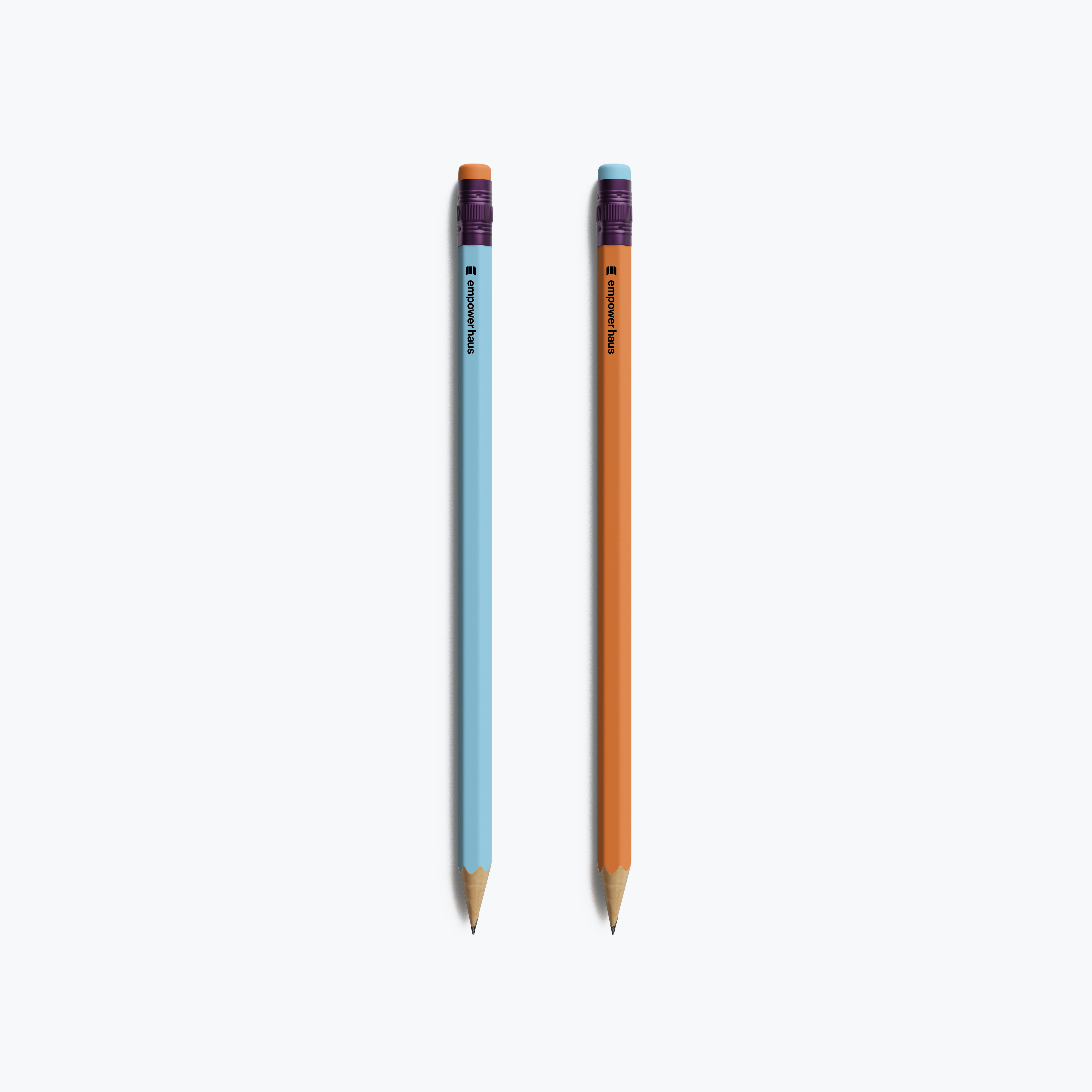
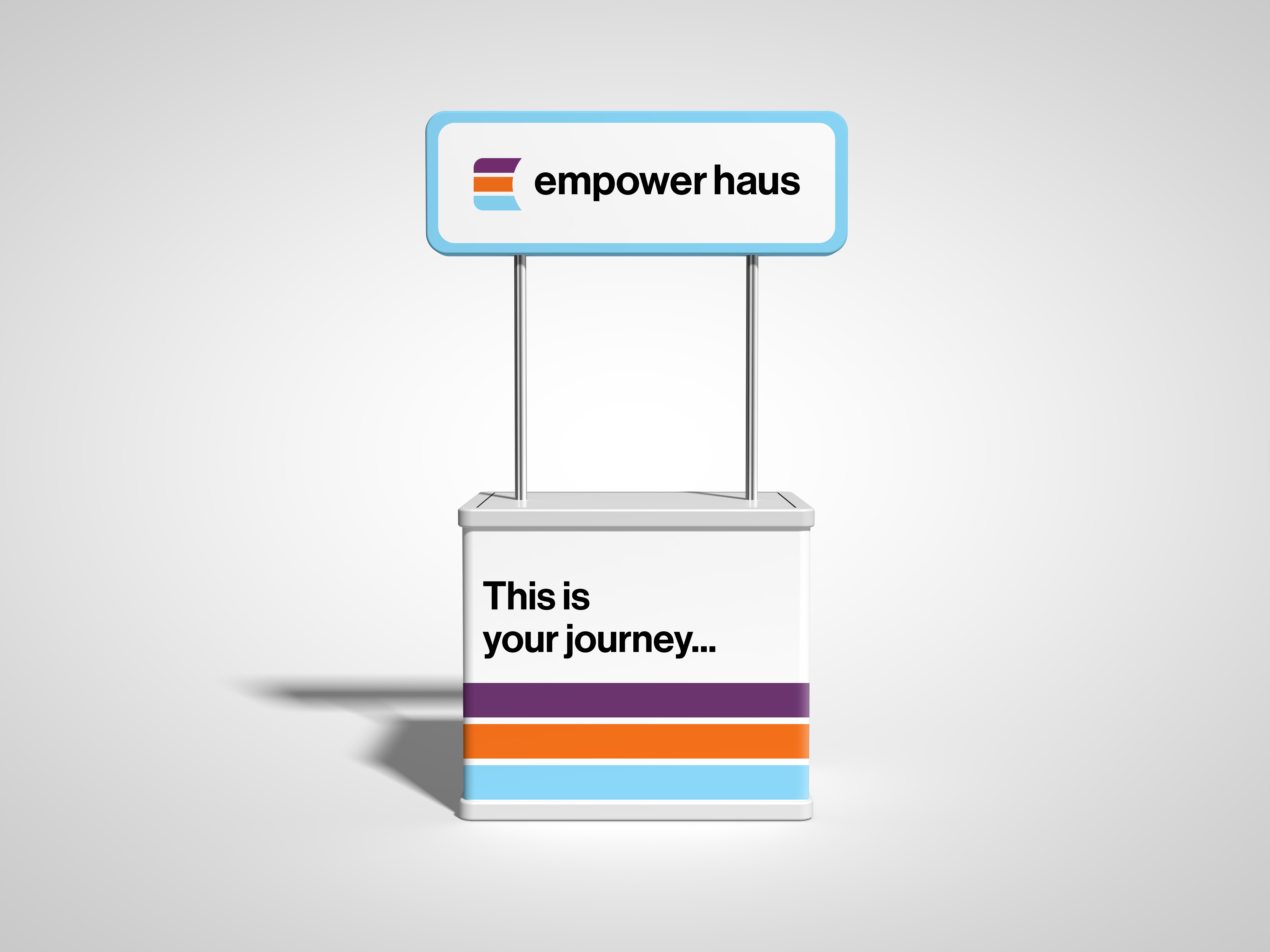
Visual identity for collegiate recruitment startup

Branding
Visual Design
Web Design
Market Research

Introduction

Empower Haus is a collegiate sports recruitment startup founded by former Michigan State and professional basketball player Brittney T. and her mother Angela T. They work to help families and student-athletes make well-informed decisions about college recruitment, ensuring selection is based on fit and opportunity rather than being influenced by attention-grabbing recruitment messaging and persuasive marketing tactics.

They needed a brand identity and website that clearly conveyed their values of clarity, trust, and confidence. I partnered with them to give Empower Haus a professional and approachable presence from the first interaction.

The Challenge

Empower Haus needed to establish a visual identity that would distinguish them in a competitive collegiate recruitment space, communicate professionalism, and resonate with young athletes and their families.

Key Considerations

Foundations

Building a brand identity from scratch with no existing visual assets.

Trust

Conveying authority and trust while remaining approachable and relevant.

Scalability

Designing a website that could grow with the company and accommodate an evolving industry.

Personality

Making sure the brand felt contemporary, dynamic, and culturally relevant for varying age groups.

Research & Descovery

To craft a visual language with resonance, I examined industry trends and business partner needs.

Sports Recruitment

Analyzed recruitment websites, agencies, and platforms to identify common messaging, design trends, and how information is presented.
sports recruiting web site screen grabsports recruiting web site screen grabsports recruiting web site screen grabsports recruiting web site screen grab

Student-athlete & Family Needs

Studied how student-athletes and their families navigate college recruitment, including pain points, decision-making criteria, and the kinds of guidance that felt most valuable.
single bike parked in front of ivy-covered campus buildingstudent carrying bookslecture hall

Findings & Insights

Overwhelm

Families can be overwhelmed by flashy recruitment tactics like lavish visits, constant coach contact, and scholarship promises.
open concept modern light library

Coherence

Visually organized and well-structured information helps build trust and confidence.
students hanging out on the stairs

Relatability

Branding that balances youthful, colorful energy with familiarity resonates with both parents and students.
Design Decisions & Rationale

Logo & Visual Identity

I developed the logo and visual system to convey trust and solidity. I refined each logo variation to function across web, print, and apparel, considering color theory, contrast, and accessibility needs. Throughout the design process, I focused on blending modernity with timeless principles and strength with warmth, giving the brand the presence of an older cousin who is dependable yet easygoing.
screengrab of logo guidelinesscreengrab of logo guidelinesgrey hooded sweatshirt with "E" logo and blue strings
person with "E" logo bucket hatpencils with "E" logo
booth with "Empower Haus" logo and headline reading, "This is your journey..."

Color & Typography

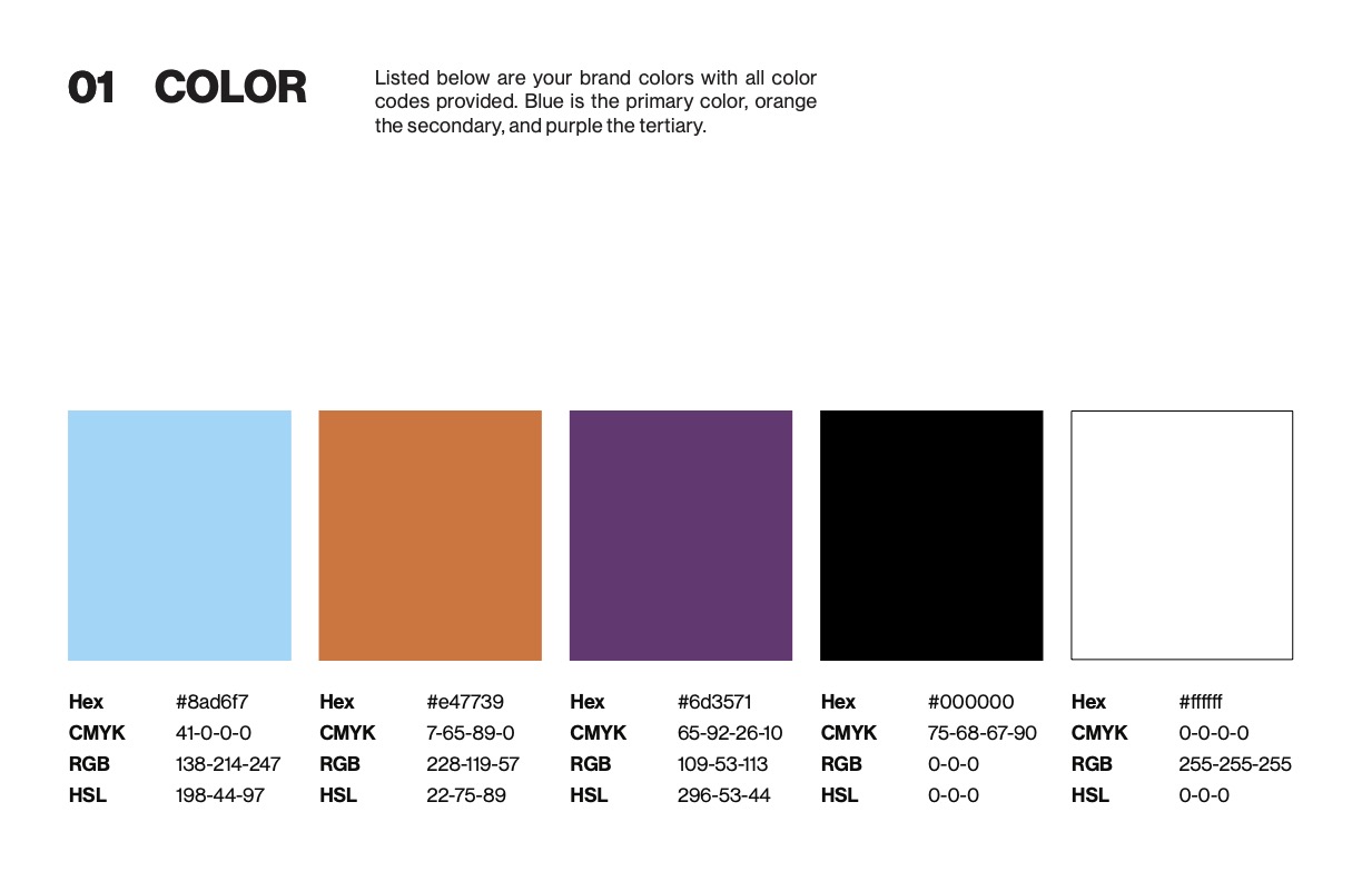
To reflect the brand’s dynamic personality, I curated a vibrant, complementary palette. Bright sky blue evokes optimism and vision, while a warm orange adds playfulness and ingenuity. Deep purple provides creativity and sophistication, grounding the palette with a spirit of innovation and depth.

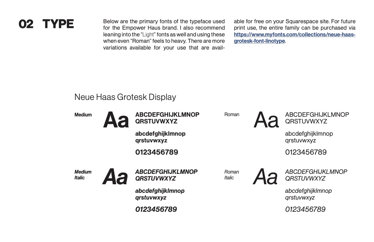
To give the brand a sense of confidence and openness, I selected a clean sans-serif typeface that emits both energy and professionalism. Its minimal forms are unobtrusive, allowing the Empower Haus’ work to take center stage. The typeface remains highly legible across digital and print, communicating fidelity without feeling formal or distant.
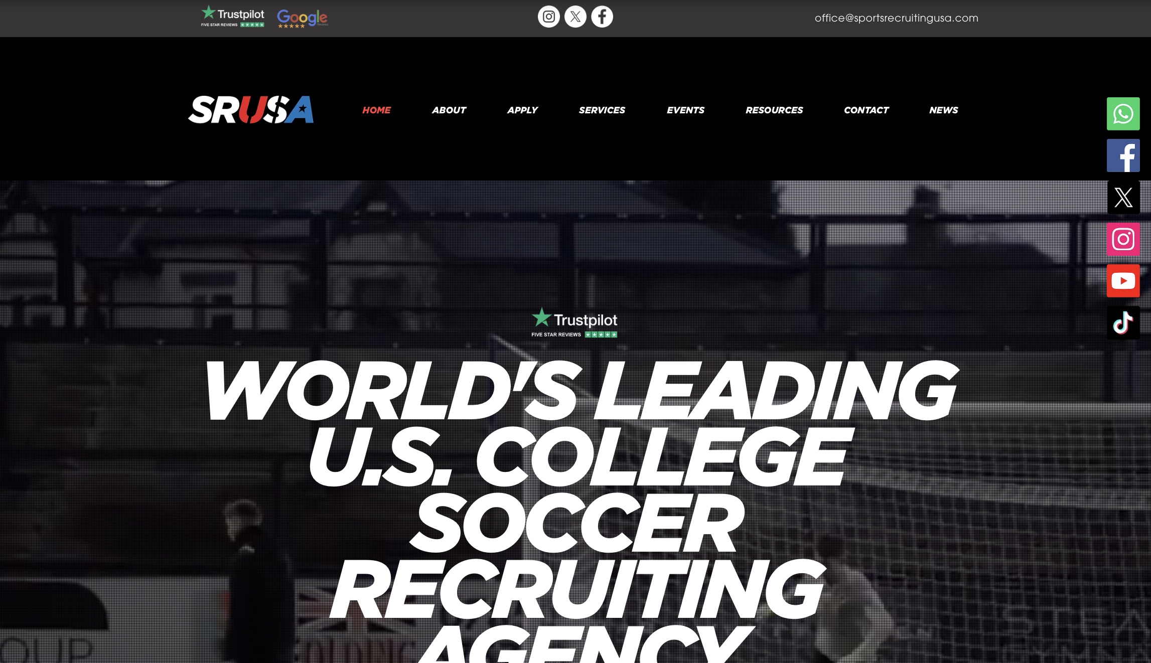
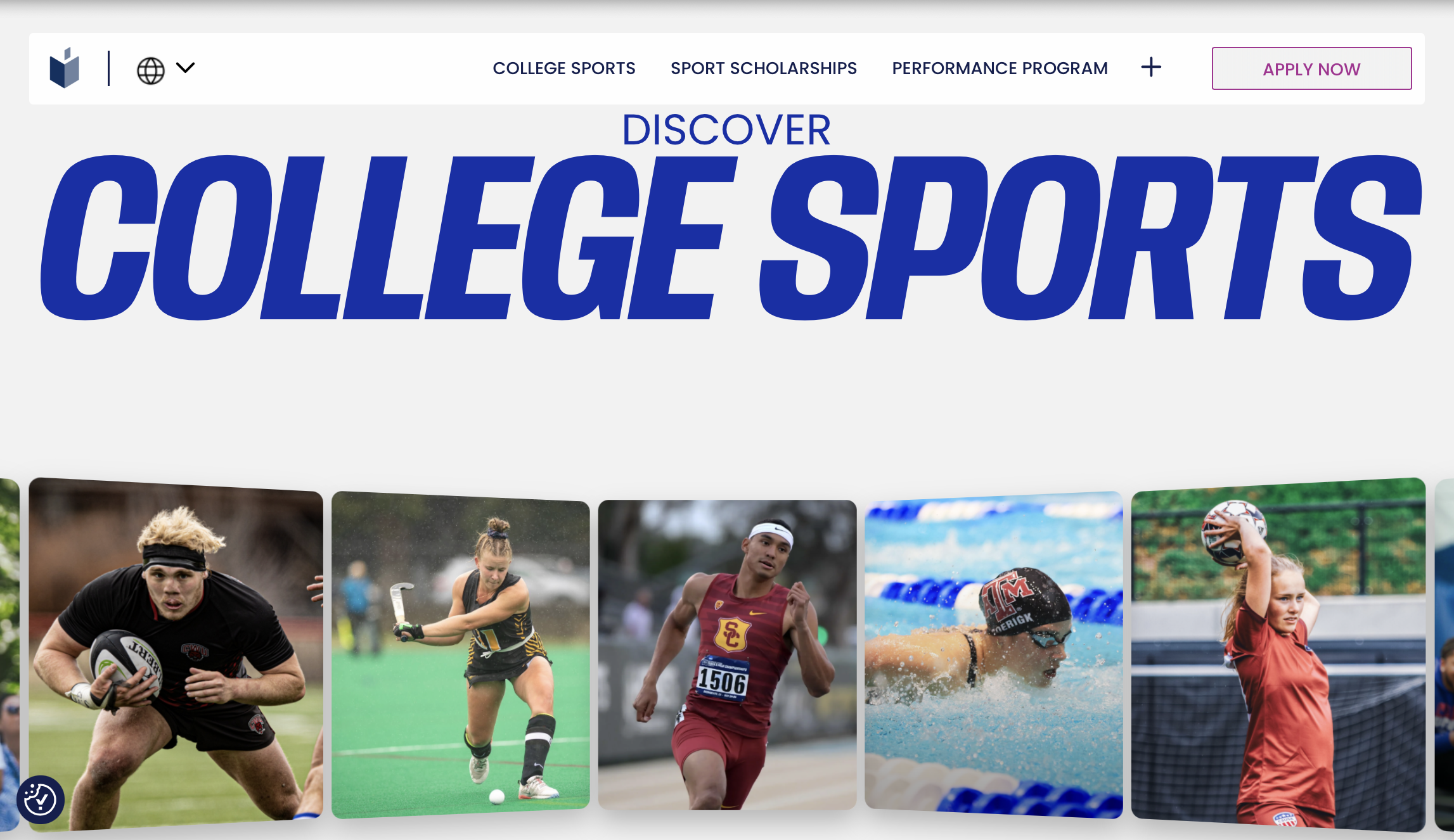
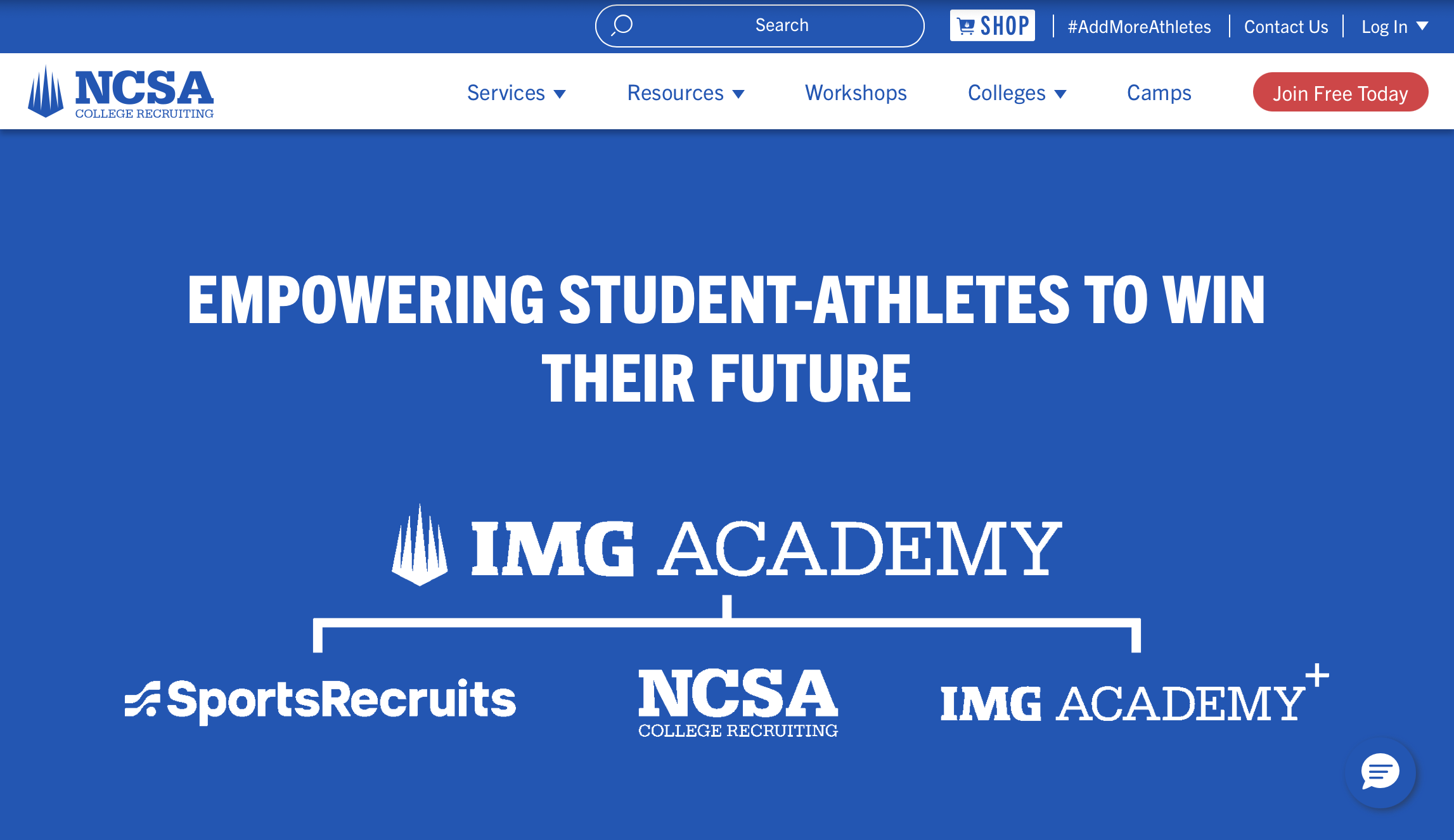
screengrab of color guidelinesscreengrab of typography guidelines

Website Design

I crafted a layout that organizes Empower Haus’ services, guidance process, and client support in a way that helps families and student-athletes find the information they need when they need it. A mobile-first strategy makes the site accessible for users on the go, while flexible design patterns allow it to grow alongside the company. Interactive elements and a thoughtful content hierarchy guide visitors naturally through each page, creating a smooth and engaging experience.

Client Feedback

open quote
This recommendation is: YES, choose Raime. I worked with Raime to create the branding and website for my start up company. I loved the collaboration from start to finish. She is super skilled, thoughtful, and receptive to feedback which makes you feel heard and that your vision is in good hands. I'd team up with her again in a heartbeat.
Brittney T. | Co-founder, Empower Haus

Results & Reflections

Unveiled a full visual identity and website, now helping athletes and families navigate recruitment with ease.

Brand Integrity

Asking a combination of specific and abstract questions to the client early on allowed me to create the brand’s persona and envision how future clients might interact with it.

Big Picture Thinking

By anticipating how the brand would function across digital platforms, print materials, and apparel, I was able to create a cohesive identity that can scale and adapt seamlessly as the company evolves.

Universal Design & Accessibility

I addressed varying levels of digital literacy and accessibility through deliberate use of color contrast, typographical hierarchy, and layout across the brand system. This reinforced that the fundamental elements of art and principles of design are paramount no matter the medium.
← Farmers.govNature Spin