Digital Ordering Platform for Concept Restaurant

Product Design
UX/UI Design
Content Design
User & Market Research
BRanding

Introduction

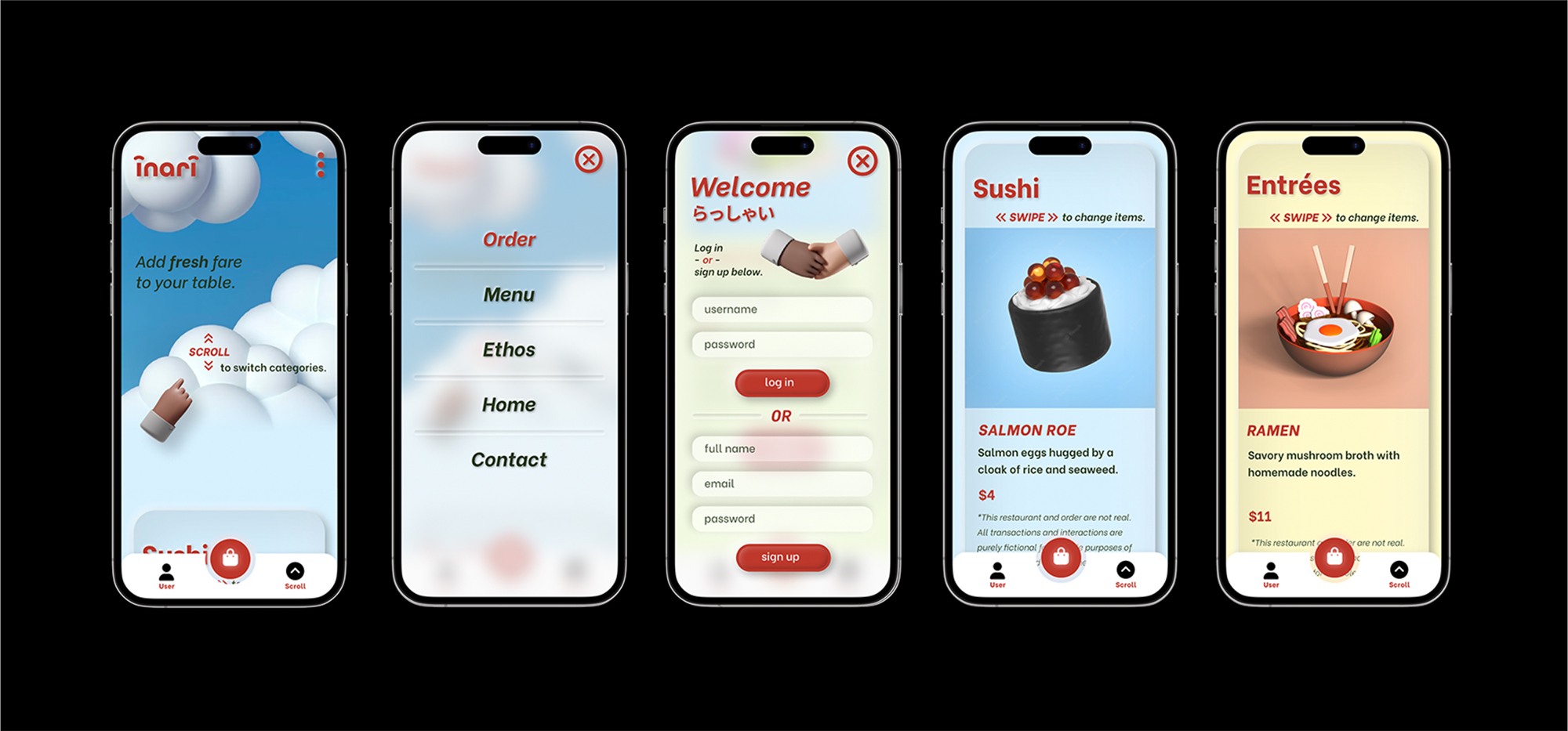
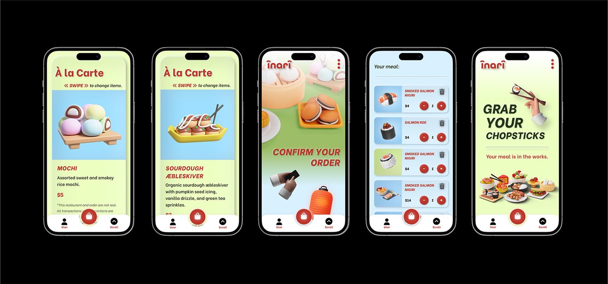
Inari is a concept restaurant and an online food ordering application I created as part of my professional UX design certification. I wanted to examine how digital ordering could feel lighthearted, intuitive, and emotionally engaging rather than transactional. Inspired by Japanese mythology and the artistry of sushi-making, Inari reimagines online food ordering as a delightful and nostalgic experience with the ease of a modern, mobile-first product.

The Challenge

Design an efficient ordering process for a concept restaurant that prioritizes emotional engagement and has a playful user interface.

Key Considerations

Usability

Creating a seamless and effective ordering flow.

Delight

Infusing the application with game-like components.

Branding

Establishing a distinctive brand and culinary presence.

Content

Using language that invites users into a positive cognitive space.

Research & Descovery

I examined patterns across responsive food delivery and gaming platforms.

Digital Ordering Platforms

Analyzed food ordering apps to uncover common patterns, behavioral expectations, and opportunities for emotive design.
Happy Tuna landing page.Online menu screenshot showing featured items: Crispy Rice Lunch Box with sushi and tea, Happy Life Lunch Box with assorted sushi, and Crispy Rice with Spicy Tuna rolls.Top view of sushi platter with edamame, miso soup, assorted sushi rolls, and a bowl of grilled eel with cucumbers on an orange background.Grubhub menu page showing sushi sashimi entree options including Sushi Deluxe, Sashimi Deluxe, Sushi and Sashimi Combo, and Chirashi Deluxe with images of sushi dishes.

Video Games

Studied gaming interfaces and branding to identify common components, button appearance and states, interaction feedback, and visual aesthetic.
Two white geese holding stolen objects stand on various clutter including a dartboard, pumpkins, and a wooden crate, with the title 'Untitled Goose Game by House House' on a blue background.Colorful cartoon scene from What The Golf game with a character falling, birds, golf ball, and scattered objects over a golf course background with Apple Arcade logo.Pixel art style character with blue skin and brown pants standing on a sidewalk next to a colorful sign reading 'STEPPY PANTS'.Colorful cartoon scene from Overcooked 2 featuring chefs on top of a food truck surrounded by zombie-like creatures in a forest.

Findings & Insights

High-rise building facade with multiple balconies and teal glass doors, some with chairs and one person sitting.

Fatigue

Crowded and repetitive layouts can make ordering feel tedious and tiring.
Interior view of a modern building ceiling with layered wooden slats and a skylight.

Readability

Keeping individual components simple and balanced reduces user confusion, creating a smoother flow.
Person adjusting colorful illuminated pegs on a large interactive light pegboard.

Tactility

3D components provide depth and presence, creating a sense of physicality that invites interaction.
Design Decisions & Rationale

Concept & Brand Inspiration

In Japanese mythology, the deity, Inari, is primarily known as the protector of rice cultivation. In the world of sushi, rice is a foundational art to be perfected. The care taken to make sure each element stands on its own results in a seemingly effortless fluency. Inari takes this elegant approach and playfully inspires its evolution in a technologically advancing world.
inari logo on 3d cloud background

Visual Identity

Bright primary and secondary colors bring users back to basics, to a place of childhood simplicity, while geometric and sans serif type follows suit. Buttons that appear tactile in nature make each step of the ordering journey a more enjoyable experience.

The concept menu includes both traditional Japanese dishes and imagined (yet, untested) fusion recipes.
Five color swatches ranging from dark red, pale yellow, light blue, dark green, to pale green, each labeled with identical Hex (BE382C), CMYK (0-71-77-25), RGB (190-56-44), and HSL (5-62-46) values.

Ordering Application

The ordering flow emphasizes common gestures, allowing users to edit their orders through multiple methods. The interface diverts from other food ordering applications, using color to engage the visual senses and make browsing feel more lively and satisfying for sighted users.
Five mobile screens displaying a restaurant app interface showing home screen, menu options, login/signup page, sushi item with salmon roe, and ramen entrée with chopsticks.Five smartphone screens showing a food ordering app with items like colorful mochi, sourdough æbleskiver, sushi selections, an order confirmation page, and a screen encouraging users to grab chopsticks with illustrations of Japanese dishes.

Results & Reflections

Imagined an online ordering application that prioritizes emotional resonance

Multiple Affordances

Providing gestural and click options for familiar actions casts a wider net for users of different mobility experiences.

Tactility

I used shadows to create three-dimensional components. If I were to design them again, I would chose hues similar to the fills rather than transparent black and white.

Historical Research

By linking our culinary present to the traditions and practices of the past, we invite customers to be a part of the ongoing story of humanity’s connection to food.
← Nature SpinAttis
white arrow up